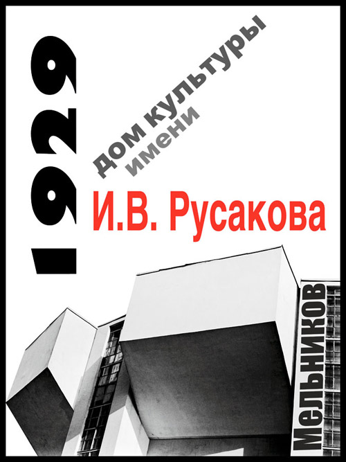
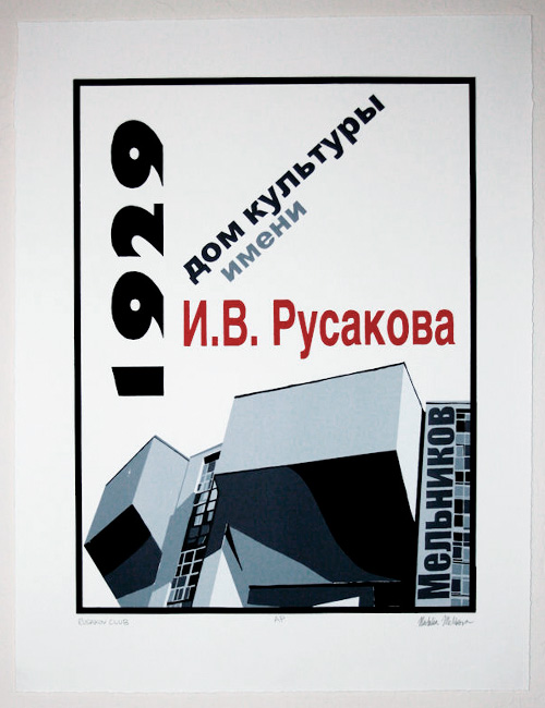
A digital print of the Ruskaov Workers’ Club poster served as a blue print for making the silkscreen version of the poster. The poster was broken down into separations according to color, each color had its own separation. The separations for the text were straightforward but the continuous tonality of the photograph had to be deconstructed into the zone system, essentially. Ansel Adams would be proud.
Here’s how I did it:
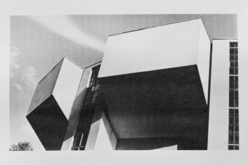
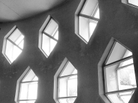
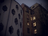
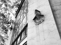
1. photograph of Rusakov Workers’ Club

2. outline tracing
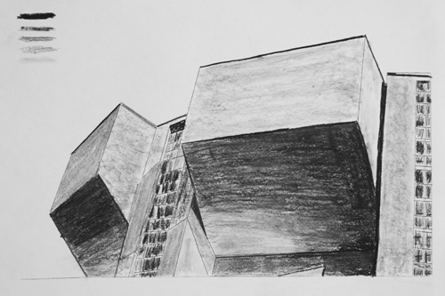
3. shading in outline according to photograph’s tonalities

4. translate shading into numbers: 1-red (text), 2-black, 3-dark grey,
4-medium grey, 5-light grey, 6-off white
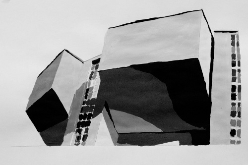
5. paint by numbers: photograph to silk screened version complete!

2. outline tracing

3. shading in outline according to photograph’s tonalities

4. translate shading into numbers: 1-red (text), 2-black, 3-dark grey,
4-medium grey, 5-light grey, 6-off white

5. paint by numbers: photograph to silk screened version complete!

3. shading in outline according to photograph’s tonalities

4. translate shading into numbers: 1-red (text), 2-black, 3-dark grey,
4-medium grey, 5-light grey, 6-off white

5. paint by numbers: photograph to silk screened version complete!

4. translate shading into numbers: 1-red (text), 2-black, 3-dark grey,
4-medium grey, 5-light grey, 6-off white

5. paint by numbers: photograph to silk screened version complete!

5. paint by numbers: photograph to silk screened version complete!
And viola! Digital print -> hand traced separations -> many layers and hours later
-> silkscreen poster. First attempt at silk screening came with its difficulties (and ink stained hands for several days), but also with great satisfaction at making something with my own hands. I love how hands on this process is!

Pingback: Rusakov Workers’s Club, in many forms | THE CONSTRUCTIVIST PROJECT